In 2021 I got a request from a friend who was active in the organization People for Future asking if
I wanted to make some illustrations for the organization. I got to freely choose which texts from
the website I wanted to illustrate.
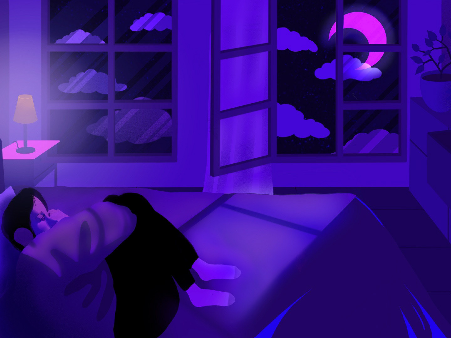
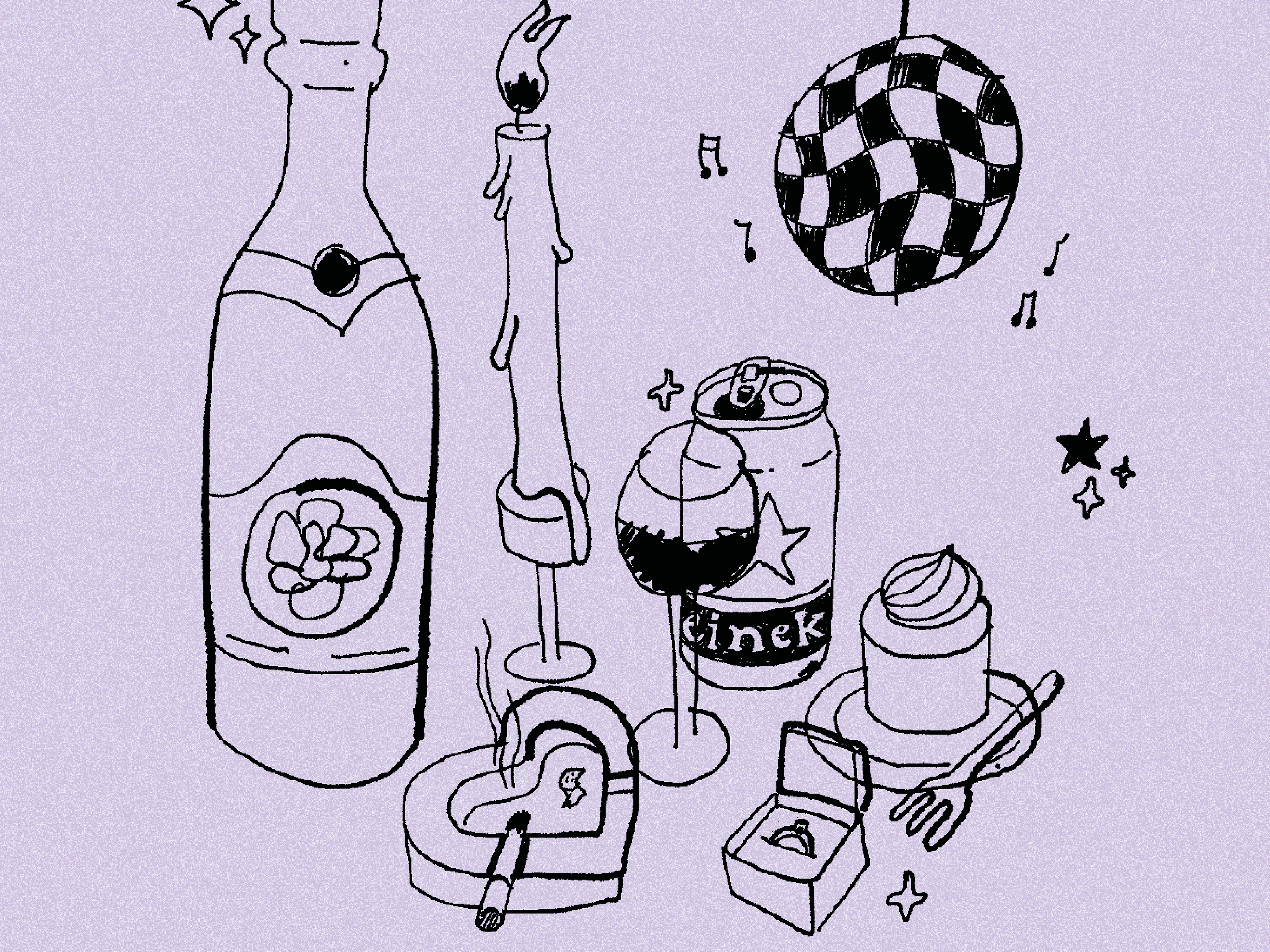
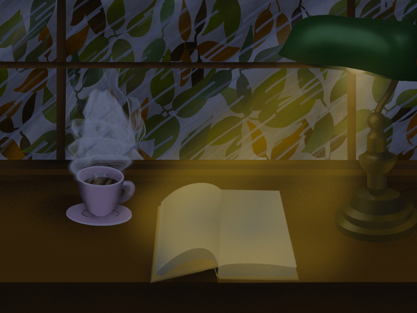
When I browsed the website, which consisted of a green color scheme and pictures of nature catastrophes, I got to thinking if there perhaps was a different way to encourage people to learn more and participate in climate activism. I wanted to create a brochure which didn’t follow the traditional colors and images usually associated to climate activism.
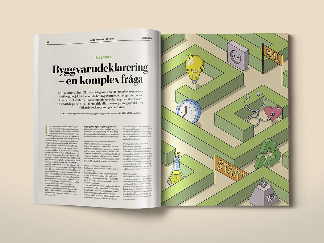
When I started researching other activist movements, I discovered that very few of them used illustrations along with their material, which I thought was a bit of a pity since I personally gravitate towards. I wanted to create a more positive and vibrant tone of the material, with the help of colors and fitting illustrations, without losing the sense of seriousness that comes with the subject.
The brochure is printed using a risograph with three different colors.
sketch process
Result
